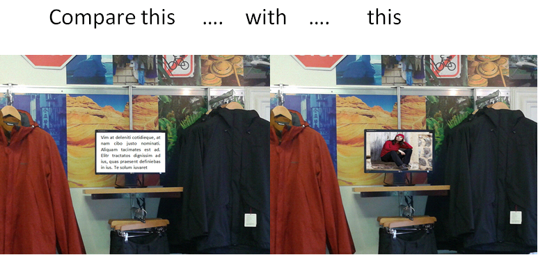
People prefer images to text. This statement is particularly true for the web, as images help us navigate through the information clutter easier. We believe that pretty pictures and videos are the way to go when it comes to digital signage content too as they are more poignant and eye- catching than plain text (or PowerPoint Presentations).
Recent research seems to support this idea but, as there’s nothing better than real life examples, take a look at some of our clients that have done a great job in creating appealing content for their digital screens.
What science says:
1) 90% of the information received by the brain is visual and is processed 60,000 times faster than text (WebMarketing Group cited by HubSpot);
2) The brain has hundreds of millions of neurons devoted to visual processing and only 8% for touch and 3% for hearing (Discover Magazine);
3) Including images improves memory and comprehension, as shown by a Levie and Lentz 1982 study based on 46 experiments comparing pictures with text.
4) The brain discards 99% of the information received but tends to register and retain what seems, in a way or another, unusual or unique (Brain Matters quoted by Mark Smiciklas of Intersection Consulting).
What the web teaches us:
1) On Facebook, photos receive more likes, comments and shares than text, links and videos (Dan Zarella);
2) Viewers are 85% more likely to purchase a product after watching a product video (Internet Retailer) and spend 100% more time on web pages with videos (Marketing Sherpa)
3) 75% of smartphone users watch videos on their phones (Ooyala cited by HubSpot)
Conclusions and advice:
– Visual content is so appealing because it offers easily digestible bits of information that attract the eye. “There’s something almost quite magical about visual information. It’s effortless. It literally pours in.’’ says David McCandles in his TED talk ‘’The Beauty of Data Vizualisation’’.
– ‘’No one wants to be reading books projected on the walls’’ (Dr. Stephen Kosslyn and Robert Lane, What Brain Research Says About Visuals in PowerPoint, Microsoft.com). No one wants to read books on indoor screens either. Reading requires more processing effort than watching or listening and people won’t be willing to put in that effort especially when on the go.
– Keep it relevant. Pretty images and videos that bring no value won’t help you either. Research shows that irrelevant information gets ignored so make sure the visuals match your viewers’ location and state of mind (see how to Put your communications in context). They should be used to convey a message, reinforce an idea, offer an example, provide details or reduce complexity. Read Digital Signage Today’s tips on how to keep digital signage content from becoming visual spam.
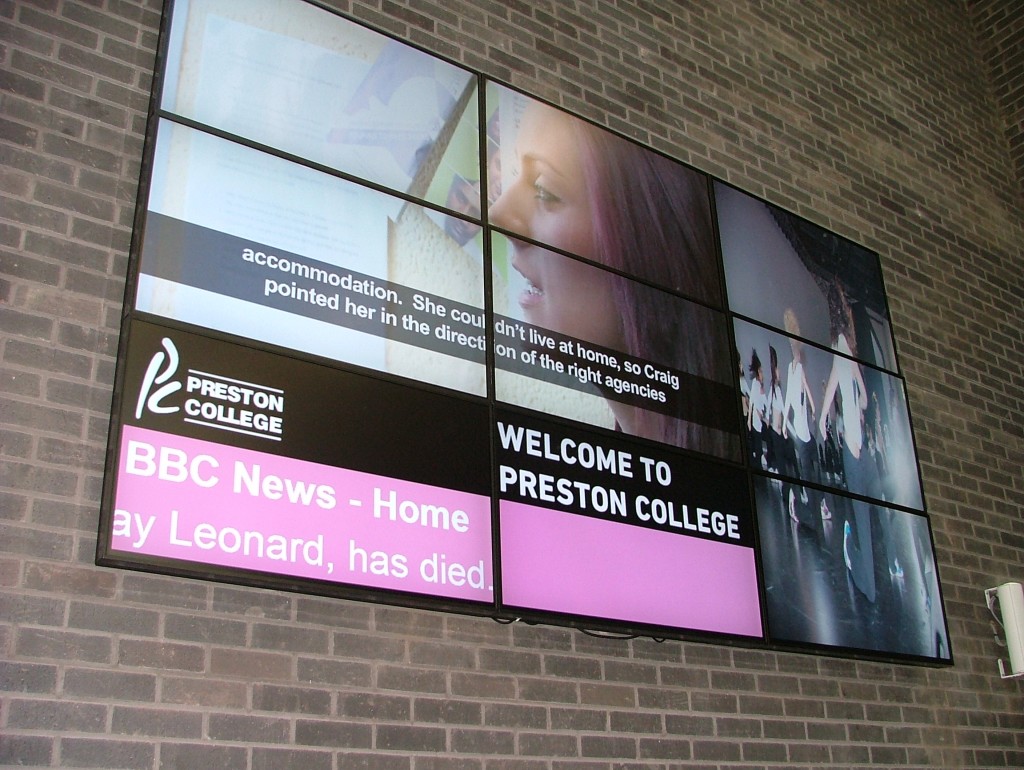
– Employ a variety of media- even text. Videos are great for catching attention and communicating to people with some spare time on their hands (mainly those waiting). Real-time information (Twitter, news, weather widgets) is an almost must- have for keeping screens fresh with zero effort. Text is not excluded but if you decide to use it, make sure it’s eye-catching. Nomatter what media you choose and how you combine it, keep it short and concise (as Preston College did). Use contrasting colours, different fonts and catchy headlines to ensure that the content makes the screen stand out.
What we’ve learned from our clients
Some of our customers are making great use of visual content for their digital signage screens. Some are using digitalsignage.NET to display training videos on screens in their offices, others are using it to show images and videos to present real-life stories that their audiences can identify with (see Preston College’s video wall below).
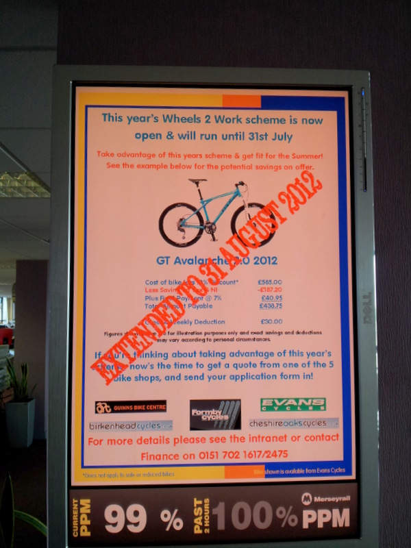
Sometimes, less is more. Merseyrail went for a text- only type of content but they’ve used colours and a catchy copy to make the screens appealing. A big like from us, particularly as this are nothing more than Microsoft Publisher files converted to JPEG’s and scheduled and published using digitalsignage.NET.
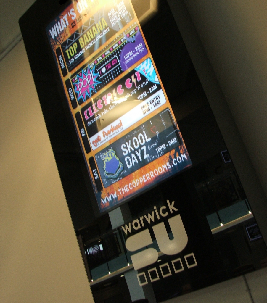
Warwick Students Union have turned- what it could have been a plain weekly schedule into a funny and colourful piece of information. They have definitely avoided these 7 content errors that we’ve highlighted a few months ago and adopted a style that resonates with their young, energetic audience.
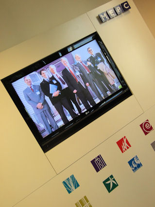
What can you do with a digital information display for corporate communications? As plain and unattractive as this might seem, MEPC managed to spice things up by displaying videos of its executives on a screen in reception area. Can you think of a better way to welcome visitors?
—
Have you had success in attracting viewers by displaying visual content on your screens? Share your success stories with us!
Need help to get started with digital signage?
About Dynamax
We are one of the longest standing digital signage providers in the world, producing digital signage software that is used to inform and entertain over 30 million consumers every week, all around the globe. digitalsignage.NET, our cloud- based digital signage solution enables companies across the UK to disseminate timely and accurate information on interconnected screens installed in their locations.


