
digital signage needs to be eye catching to attract viewers to look at the screens. 
But did you know that the types of colours used in your advertisement will have a big influence on how your viewer reacts. Get your colours wrong and you might put viewers off and not get your message across. Luckily we have some tips to help you out.
Colour scales– there are two common scales used when it comes to colour, RGB (Red, Green, Blue and CMYK (Cyan,Magenta, Yellow and Key, which is usually black). RGB is more common in digital signage as this is used by commercial displays. Print based media uses CMYK. Make sure that you choose the correct scale when creating content for digital signage displays.
Harnessing to power of colours in advertising– when creating an advertisement, brand managers and advertising agencies think long and hard about the colours that they are going to use. The colour can have a big impact on the viewer before reading and understanding what the advertisement is about. Understanding the psychology of colours is very important before making your colour choice for your digital signage ads.
The Psychology of colour– choosing a colour that has meaning will subconsciously send out a positive or negative message. Red, or example mean danger and we always associate red with hazards, stop signs etc. So should we not use red? Absolutely , companies like Mcdonalds and KFC both use red in there logos but are mixed with other colours to create an enticing effect.
So what effect does colour have on viewers?– McDonalds use red and yellow. The red shows passion and love and mixed with yellow for excitement and happiness the two colours match perfectly. KFC use Red, black and white in their logo. The black and white shows neutrality, trustworthy and makes the image of Colonel Sander stand out.
Colour meanings
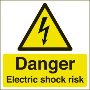
- Red- While red can signify danger it can be used to excellent effect in marketing campaigns which need to evoke strong emotions. Red is associated with passion and love but its strong intensity also signifies strength, determination and power.
- Orange-Orange is also a dynamic and energetic colour associated with Joy and sunshine. It draws attention to itself for its lively nature and can be used successfully for food or toy adverts that want to stand out from the rest, or for campaigns aimed at a youthful target market.
![]()
- Yellow-Yellow is bright, like the sun and full of energy. Attention grabbing, it also signifies playfulness, amusement, curiosity and happiness making it an ideal colour choice for advertising children’s product or items relating to leisure. When combined with black it can be used as a warning.
- Green –Green symbolises nature and the environment in most people’s minds. It is also associated with growth, harmony and fertility. It is an excellent colour to form the basis of safety warnings on pharmaceuticals and for companies concerned with the environment.
![]()
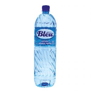
- Blue-Blue is a colour which arouses trust and loyalty in the viewer. It also suggests confidence, intelligence and faith. This is why it is one of the most popular colours in corporate brands and designs. Blue creates a calming effect and is also used for advertising product like mineral water. Large corporations like Banks, financial institutions and medical companies always rely on blue in their advertising campaigns indicating that they can be trusted implicitly.
- Purple Purple is associated with luxury, royalty, dreams, mystery and elegance. Light shades of purple are soothing and work well for beauty orientated advertising. Light purple evokes romantic and nostalgic feelings where as Dark purple evokes gloom and sad feelings. Great for our company logo.
![]()
- Pink-Pink will always be associated with femininity at a subconscious level making it a hard colour to use in advertising if the target market is anything but a female viewer. It may also be used to promote items for babies and bubble gum.

- Brown-Brown is rarely seen as an exciting colour. While it is sometimes considered dull, it also represents steadfastness, simplicity, friendliness, dependability, and health. It is the colour of our soil growth, fertility, and earth, and it is associated the concepts of “all natural” and “organic.” . Used in coffee based ads.

- Black and white- White is associated with light, goodness, innocence, purity, and virginity. It is considered to be the colour of perfection, but Black is associated with power, elegance, formality, death, evil, and mystery. Black-and-white advertising can get consumers to focus on the basics or to promote superior product features. Black evokes sophistication; white communicates innocence.


Thanks to colour wheel pro for information on colours